极坐标图
极坐标系是一种二维坐标系,该坐标系统中任意位置可由夹角相对原点(极点)的距离来表示。向东的方向是极坐标系角度的起始位置, 逆时针增加角度。绘制极坐标图需要先创建极坐标系,axes函数中设置参数polar=True,然后就可以用绘图函数来绘制极坐标图。
r = arange(0, 2, 0.01)
theta = 2 * pi * r

ax = axes(polar=True)
plot(theta, r, color='b', linewidth=2, label='Line 1')
plot(theta, r*1.5, color='r', linewidth=2, label='Line 2')
title('Polor chart example')
legend(xshift=80)
antialias(True)
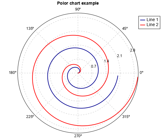
上述例子中antialias函数可以设置图形是否反锯齿绘制,反锯齿会使图形显示得更平滑。
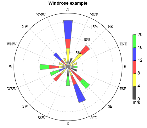
气象领域风玫瑰图是典型的极坐标图,可以用windrose函数绘制,参数主要有风向、风速数据、方位数、风速分级等,能够表示不同风向区间 和风速区间的占比情况。和极坐标不同,风玫瑰图中0度在正北方向,并且顺时针增加。
fn = os.path.join(migl.get_sample_folder(), 'ASCII', 'windrose.txt')
ncol = numasciicol(fn)
nrow = numasciirow(fn)
a = asciiread(fn,shape=(nrow,ncol))
ws=a[:,0]
wd=a[:,1]

n = 16
wsbins = arange(0., 21.1, 4)
cols = makecolors(['k','y','r','b','g'], alpha=0.7)
rtickloc = [0.05,0.1,0.15,0.18]
ax, bars = windrose(wd, ws, n, wsbins, rmax=0.18, colors=cols,
    rtickloc=rtickloc, width=0.5)
colorbar(bars, shrink=0.6, vmintick=True, vmaxtick=True, xshift=10,
    label='m/s', labelloc='bottom')
ax.set_xtick_font(name='Times New Roman')
title('Windrose example')
antialias(True)
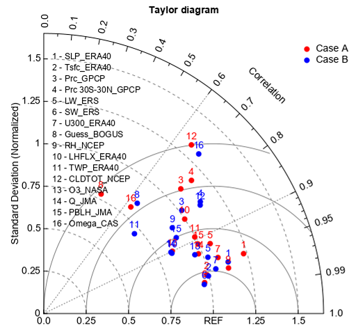
气象领域多模式评估还有一种常用的泰勒(Taylor)图,只包含了极坐标的第一象限,可以同时体现相关系数,标准差以及均方根误差。 taylor_diagram函数用来绘制泰勒图,参数主要有模式和观测的标准差、相关系数等。图中辐射线代表相关系数,横纵轴代表标准差, 下方的弧线代表均方根误差。
case = ['Case A', 'Case B']
ncase = len(case)

var = ["SLP","Tsfc" ,"Prc","Prc 30S-30N","LW","SW", "U300", "Guess",
    "RH" ,"LHFLX","TWP","CLDTOT","O3","Q" , "PBLH", "Omega"]
nvar = len(var)

source = ["ERA40", "ERA40","GPCP" , "GPCP", "ERS", "ERS", "ERA40", "BOGUS",
    "NCEP",  "ERA40","ERA40", "NCEP", "NASA", "JMA", "JMA" , "CAS"]

#Case A
CA_ratio = np.array([1.230, 0.988, 1.092, 1.172, 1.064, 0.966, 1.079, 0.781,
            1.122, 1.000, 0.998, 1.321, 0.842, 0.978, 0.998, 0.811])
CA_cc = np.array([0.958, 0.973, 0.740, 0.743, 0.922, 0.982, 0.952, 0.433,
                0.971, 0.831, 0.892, 0.659, 0.900, 0.933, 0.912, 0.633])

#Case B
CB_ratio = np.array([1.129, 0.996, 1.016, 1.134, 1.023, 0.962, 1.048, 0.852,
                0.911, 0.835, 0.712, 1.122, 0.956, 0.832, 0.900, 1.311])
CB_cc = np.array([0.963, 0.975, 0.801, 0.814, 0.946, 0.984, 0.968, 0.647,
                0.832, 0.905, 0.751, 0.822, 0.932, 0.901, 0.868, 0.697])

#arrays to be passed to taylor_diagram
ratio = zeros((ncase, nvar))
cc = zeros((ncase, nvar))
ratio[0,:] = CA_ratio
ratio[1,:] = CB_ratio
cc[0,:] = CA_cc
cc[1,:] = CB_cc

#Plot
ax, gg = taylor_diagram(ratio, cc, colors=['r','b'], title='Taylor diagram')
ax.legend(gg, case, frameon=False, xshift=50)
models = None
i = 1
for v,s in zip(var, source):
    model = '%i - %s_%s' % (i, v, s)
    if models is None:
        models = model
    else:
        models = models + '\n' + model
    i += 1
ax.text(0.05, 0.5, models, fontsize=12)