图形标注和多Y轴
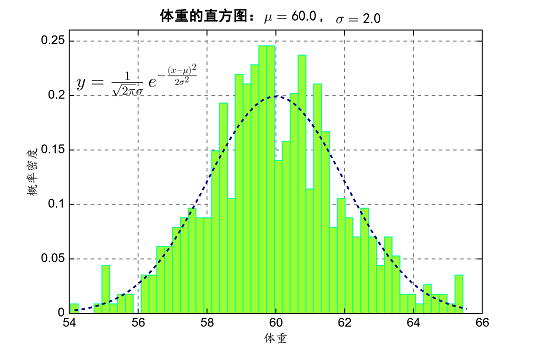
绘图函数中有一些图形文字标记类的函数,例如title函数设置图形标题,xlabel和ylabel函数设置X和Y轴的标签,text函数可以在图形 任意位置添加文字标注。中文标注需要用fontname设置一个中文字体,中文字符串前的u表示该字符串为unicode字符串。MeteoInfo 支持LaTeX语法输入和显示特殊字符和公式,LaTeX字符串起始和结束字符都是“$”。
mu = 60.0
sigma = 2.0
x = mu + sigma*np.random.randn(500)
bins = 50
n, bins, patches = hist(x, bins, density=True, histtype="bar",
    facecolor="#99FF33", edgecolor="#00FF99", alpha=0.75)
y = ((1/(np.power(2*np.pi, 0.5)*sigma))*np.exp(-0.5*
    np.power((bins-mu)/sigma, 2)))

plot(bins, y, color="#7744FF", linestyle="--", linewidth=2)
grid(linestype=":", linewidth=1, color="gray", alpha=0.2)
text(54, 0.2, r"$y=\frac{1}{\sqrt{2\pi}\sigma}e^{-\frac{(x-\mu)^2}{2\sigma^2}}$",
    fontsize=20)
xlabel(u"体重", fontname=u'楷体')
ylabel(u"概率密度", fontname=u'楷体')
title(u"体重的直方图" + r":$\mu=60.0$, $\sigma=2.0$", fontsize=16, fontname=u'黑体')
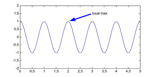
带箭头的指向标注可以用annotate函数添加,参数主要有标注文本、标注位置、标注文本的位置、对齐方式、箭头属性等。
x = arange(0.0, 5.0, 0.01)
y = cos(2 * pi * x)
plot(x, y, lw = 2)
annotate('local max', (2,1), (3,1.5), yalign='center',
    arrowprops=dict(linewidth=4, headwidth=15, color='b', shrink=0.05))
ylim(-2, 2)
专门绘制箭头的函数是arrow,可以通过headwidth、headlength参数控制箭头头部的大小,overhang参数设置箭头悬垂程度。
v = [-0.2, 0, .2, .4, .6, .8, 1]
for overhang in v:
    arrow(.1, overhang, .6, 0, headwidth=0.05, overhang=overhang, length_includes_head=True)

xlim(0, 1)
ylim(-0.3, 1.1)
yticks(v)
xticks([])
ylabel('overhang')
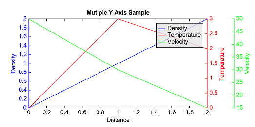
在进行同时段不同要素气象数据对比时常用多Y轴来避免不同要素数据值范围相差过大带来的绘图问题,实现的过程实际上是每个要素用一个坐标系, 多个坐标系位置(position)相同,X轴设置相同,Y轴分别设置。相关函数是twinx,如果是Y轴相同,而X轴不同则用twiny函数。下面的例子 用三个不同的Y轴将多个要素一起绘制。
ax1 = axes(position=[0.113,0.15,0.7,0.7])
yaxis(ax1, color='b')
line1 = plot([0, 1, 2], [0, 1, 2], 'b-', label="Density")
xlabel('Distance')
ylabel('Density', color='b')
title('Mutiple Y Axis Sample')

ax2 = twinx(ax1)
yaxis(ax2, color='r')
line2 = plot([0, 1, 2], [0, 3, 2], 'r-', label="Temperature")
ylabel('Temperature', color='r')

ax3 = twinx(ax1)
yaxis(ax3, location='right', position=['axes', 1.15], color='g')
line3 = plot([0, 1, 2], [50, 30, 15], 'g-', label="Velocity")
ylabel('Velocity', color='g')
lines = [line1, line2, line3]
legend(lines, facecolor=[230,230,230,200])