Make a bar plot.
| Parameters: |
|
|---|---|
| Returns: | Bar legend break. |
| Character | Description |
|---|---|
| ‘-‘ | horizontal hatch style |
| ‘|’ | vertical hatch style |
| ‘\’ | forward_diagonal hatch style |
| ‘/’ | backward_diagonal hatch style |
| ‘+’ | cross hatch style |
| ‘x’ | diagonal_cross hatch style |
| ‘.’ | dot hatch style |
Examples:
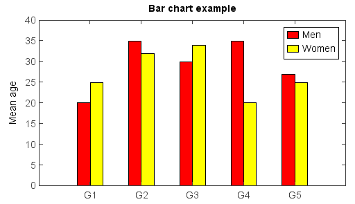
The bar width in the chart was decided automatically according to data series number.
menMeans = [20, 35, 30, 35, 27]
bar(menMeans, color='r', label='Men')
womenMeans = [25, 32, 34, 20, 25]
bar(womenMeans, color='y', label='Women')
ylim(0, 40)
ylabel('Mean age')
xticks(arange(1, len(menMeans) + 1), ['G1','G2','G3','G4','G5'])
legend()
title('Bar chart example')
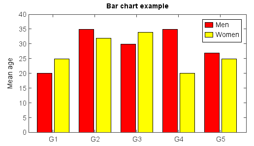
The bar width and plot position could be set manually with x array and width argument.
menMeans = [20, 35, 30, 35, 27]
n = len(menMeans)
ind = arange(n)
width = 0.35
gap = 0.06
bar(ind, menMeans, width, color='r', label='Men')

womenMeans = [25, 32, 34, 20, 25]
bar(ind + width + gap, womenMeans, width, color='y', label='Women')

xlim(-0.2, 5)
ylim(0, 40)
ylabel('Mean age')
xticks(ind + width + gap / 2, ['G1','G2','G3','G4','G5'])
legend()
title('Bar chart example')
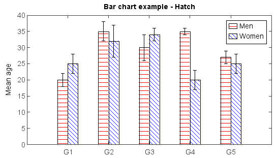
Hatch fill example using hatch argument:
menMeans = [20, 35, 30, 35, 27]
std_men = (2, 3, 4, 1, 2)
bar(menMeans, yerr=std_men, color='r', label='Men', hatch='-')

womenMeans = [25, 32, 34, 20, 25]
std_women = (3, 5, 2, 3, 3)
bar(womenMeans, yerr=std_women, color='b', label='Women', hatch='\\')

ylim(0, 40)
ylabel('Mean age')
xticks(arange(1, len(menMeans) + 1), ['G1','G2','G3','G4','G5'])
legend()
title('Bar chart example - Hatch')