Taylor diagram chart
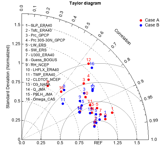
Taylor diagrams provide a visual framework for comparing a suite of variables from one or more test data sets to one or more reference data sets. Commonly, the test data sets are model experiments while the reference data set is a control experiment or some reference observations.
case = ['Case A', 'Case B']
ncase = len(case)

var = ["SLP","Tsfc" ,"Prc","Prc 30S-30N","LW","SW", "U300", "Guess",
    "RH" ,"LHFLX","TWP","CLDTOT","O3","Q" , "PBLH", "Omega"]
nvar = len(var)

source = ["ERA40", "ERA40","GPCP" , "GPCP", "ERS", "ERS", "ERA40", "BOGUS",
    "NCEP",  "ERA40","ERA40", "NCEP", "NASA", "JMA", "JMA" , "CAS"]

#Case A
CA_ratio = np.array([1.230, 0.988, 1.092, 1.172, 1.064, 0.966, 1.079, 0.781,
            1.122, 1.000, 0.998, 1.321, 0.842, 0.978, 0.998, 0.811])
CA_cc = np.array([0.958, 0.973, 0.740, 0.743, 0.922, 0.982, 0.952, 0.433,
                0.971, 0.831, 0.892, 0.659, 0.900, 0.933, 0.912, 0.633])

#Case B
CB_ratio = np.array([1.129, 0.996, 1.016, 1.134, 1.023, 0.962, 1.048, 0.852,
                0.911, 0.835, 0.712, 1.122, 0.956, 0.832, 0.900, 1.311])
CB_cc = np.array([0.963, 0.975, 0.801, 0.814, 0.946, 0.984, 0.968, 0.647,
                0.832, 0.905, 0.751, 0.822, 0.932, 0.901, 0.868, 0.697])

#arrays to be passed to taylor_diagram
ratio = zeros((ncase, nvar))
cc = zeros((ncase, nvar))
ratio[0,:] = CA_ratio
ratio[1,:] = CB_ratio
cc[0,:] = CA_cc
cc[1,:] = CB_cc

#Plot
ax, gg = taylor_diagram(ratio, cc, colors=['r', 'b'], title='Taylor diagram')
ax.legend(gg, case, frameon=False, xshift=50)
models = None
i = 1
for v,s in zip(var, source):
    model = '%i - %s_%s' % (i, v, s)
    if models is None:
        models = model
    else:
        models = models + '\n' + model
    i += 1
ax.text(0.05, 0.5, models, fontsize=12)