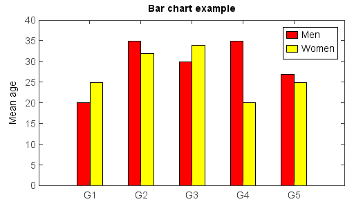
Bar chart
Bar chart was created by bar() function. The bar width in the chart was decided automatically
according to data series number.
menMeans = [20, 35, 30, 35, 27]
n = len(menMeans)
ind = arange(n)
width = 0.2
bar(ind, menMeans, width, color='r', label='Men')
womenMeans = [25, 32, 34, 20, 25]
bar(ind + width, womenMeans, width, color='y', label='Women')
xlim(-0.2, 4.6)
ylim(0, 40)
ylabel('Mean age')
xticks(ind + width, ['G1','G2','G3','G4','G5'])
legend()
title('Bar chart example')
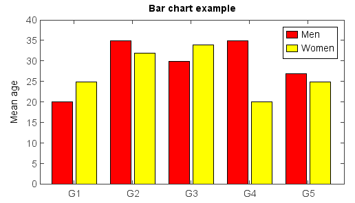
The bar width and plot position could be set manually with x array and width argument.
menMeans = [20, 35, 30, 35, 27]
n = len(menMeans)
ind = arange(n)
width = 0.35
gap = 0.06
bar(ind, menMeans, width, color='r', label='Men')

womenMeans = [25, 32, 34, 20, 25]
bar(ind + width + gap, womenMeans, width, color='y', label='Women')

xlim(-0.2, 5)
ylim(0, 40)
ylabel('Mean age')
xticks(ind + width + gap / 2, ['G1','G2','G3','G4','G5'])
legend()
title('Bar chart example')
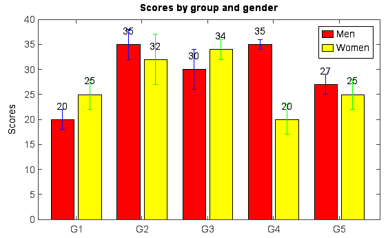
Y error bar and text labels on bars:
menMeans = [20, 35, 30, 35, 27]
std_men = (2, 3, 4, 1, 2)
n = len(menMeans)
ind = arange(n)
width = 0.35
gap = 0.06
bar(ind, menMeans, width, yerr=std_men, color='r', ecolor='b', label='Men')
for j in range(n):
    text(ind[j] + width / 4, menMeans[j] + 2, str(menMeans[j]))

womenMeans = [25, 32, 34, 20, 25]
std_women = (3, 5, 2, 3, 3)
bar(ind + width + gap, womenMeans, width, yerr=std_women, color='y', ecolor='g', label='Women')
for j in range(n):
    text(ind[j] + + width + gap + width / 4, womenMeans[j] + 2, str(womenMeans[j]))

xlim(-0.2, 5)
ylim(0, 40)
ylabel('Scores')
xticks(ind + width + gap / 2, ['G1','G2','G3','G4','G5'])
legend()
title('Scores by group and gender')
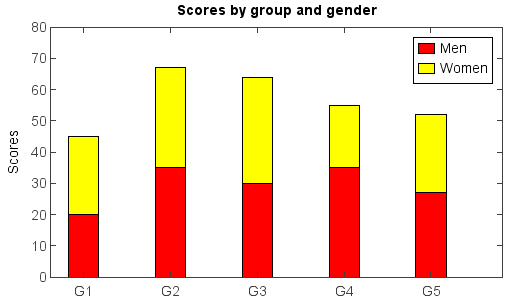
Stacked bar example using bottom argument:
menMeans = [20, 35, 30, 35, 27]
n = len(menMeans)
ind = arange(n)
width = 0.35
bar(ind, menMeans, width, color='r', ecolor='b', label='Men')

womenMeans = [25, 32, 34, 20, 25]
bar(ind, womenMeans, width, bottom=menMeans, color='y', ecolor='g', label='Women')

xlim(-0.2, 5)
ylim(0, 80)
ylabel('Scores')
xticks(ind + width / 2, ['G1','G2','G3','G4','G5'])
legend()
title('Scores by group and gender')
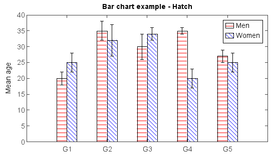
Hatch fill example using hatch argument:
menMeans = [20, 35, 30, 35, 27]
std_men = (2, 3, 4, 1, 2)
n = len(menMeans)
ind = arange(n)
width = 0.2
gap = 0.06
bar(ind, menMeans, width, yerr=std_men, color='r', label='Men', hatch='-')

womenMeans = [25, 32, 34, 20, 25]
std_women = (3, 5, 2, 3, 3)
bar(ind + width + gap, womenMeans, width, yerr=std_women, color='b', label='Women', hatch='\\')

xlim(-0.2, 5)
ylim(0, 40)
ylabel('Mean age')
xticks(ind + (width + gap) * 0.5, ['G1','G2','G3','G4','G5'])
legend()
title('Bar chart example - Hatch')
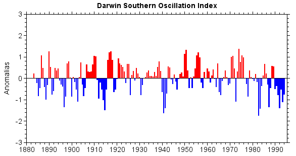
An example to draw Darwin Southern Oscillation Index with bar chart:
fn = 'D:/Temp/nc/soi.nc'
f = addfile(fn)
yms = f['date'][::8]       #Year and month
dsoik = f['DSOI_KET'][::8] #Darwin SOI Index via KET 11pt Smth
dsoid = f['DSOI_DEC'][::8] #Darwin Decadal SOI Index

#Set dates and colors
dates = []
cols = []
for ym,d in zip(yms,dsoik):
    dates.append(datetime.datetime(ym / 100, ym % 100, 1))
    if d >= 0:
        cols.append('r')
    else:
        cols.append('b')

#Bar plot
bar(dates, dsoik, color=cols, edgecolor=None)
xlim(dates[0], dates[-1])
ylim(-3, 3)
xaxis(axistype='time', minortick=True, tickin=False)
yaxis(minortick=True, tickin=False)
ylabel('Anomalias')
title('Darwin Southern Oscillation Index')